


A Power Spectrum is not Just a Really Good Spectrum
- Jul 20, 2015
- 4 min read
Early last week a paper with some wiggly curves in it was released by the Planck collaboration. Those curves are so epic-ally cool that I am eager to blog about them. In preparation for that post, this post serves to introduce the most important property of a cosmic microwave background map, a statistical quantity know as "the power spectrum."
My very clever friends who build and deploy instruments have managed to make amazing maps of the cosmic microwave background. The best full-sky map comes from the Planck satellite. And it is quite amazing indeed.
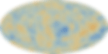
This is a map of the full sky, and only has this funny oval shape as the result of projecting the sphere of the full sky onto the plane of your screen. A red region in the map indicates that the light observed by Planck, coming from the part of the sky that corresponds to that location on the map, is brighter than average. The light observed by Planck, in the microwave region of the spectrum, has been traveling for a very, very long time -- since long before there were any stars. This light, for the most part, last interacted with matter when the universe was about 370,000 years old. It gives us an opportunity to study the universe as it was at this early time. To gain a better understanding of this map you can check out this narrated animation.
So how do we learn things from this map? Our theories do not actually predict the map. They predict statistical properties of the map. The most important statistical property is called "the power spectrum." The power spectrum tells us about the smoothness/roughness of the map, as a function of angular scale.
Now what does that mean, "as a function of angular scale?" Well, how would you describe the surface of the Pacific Ocean? Is it smooth or rough? The answer depends on length scale. On very large scales, scales much larger than the typical wavelength of a wave, it is quite smooth. But then on scales the length of a typical wave it is rougher. Zooming in further, to length scales smaller than a typical wave wavelength, it might appear smooth again.
We can do the same type of analysis with a map of the cosmic microwave background. Below is a screenshot from a European Space Agency (ESA) video showing six different cosmic microwave background maps. To get these six maps from the above map, two things have been done. First, there's been an annoying, unnecessary, switch from a color scale to a grey scale. Secondly, the contributions to the map have been separated out into six different maps based on the angular scale of the fluctuations.

You can see the map in the image above with the red arrow pointing toward it has only large-scale fluctuations in it. All the smaller-scale fluctuations have been filtered out. The next map over to the right and slightly up (with red arrow pointing to it in image below) has in it only the flucutations with somewhat smaller angular scales. The really large-scale features shown in the first map have all been removed, as is the case for even smaller-scale fluctuations.

The next map over to the right and somewhat down (with arrow pointing to it in the image below) has fluctuations in it with yet smaller angular scales than the first two. And so on as we go around the

figure clockwise. The features in the last three maps are all on such small angular scales, that at the level of resolution of this image, it is difficult to see them.
With the above as prologue, I think you are ready to watch the ESA video that is attempting to explain what a power spectrum is.
So, the power spectrum (that curve in the middle of the six maps), is an expression of the amplitude of fluctuations in the map as a function of angular scale. Keep in mind it is plotted with larger angular scales to the left and smaller angular scales to the right.
Now, to test your understanding, it's time to play
Match the Power Spectrum with the Map!

One map on the left has a power spectrum given by the cyan curve on the top right and the other map has a power spectrum given by the cyan curve in the bottom right. Which map goes with which cyan curve? Please ignore, for now, the red curve and the data points.
Do you need a hint? If so, here's one: ask yourself which map has a higher amplitude of fluctuations on large angular scales. I'll publish the correct answer in my next post.
Going from the bottom cyan power spectrum to the top one is, to use an audio analogy, like cranking up the bass on a sterio equalizer. It amplifies the large-scale fluctuations, just like cranking up the bass amplifies the long time-scale (low-frequency) fluctuations. [And to follow this audio analogy further, you might want to look at this "CMB sonification tool."]
Note that these maps and spectrum images came from a NASA web site with a tool that allows you to adjust parameters of the standard cosmological model and see how the power spectra change. You might want to play around with it.
It is the theoretical power spectra that we compare with the power spectrum measured from the map. This is how we compare observation with theory. This is the basis for our most precise determinations of cosmological parameters.